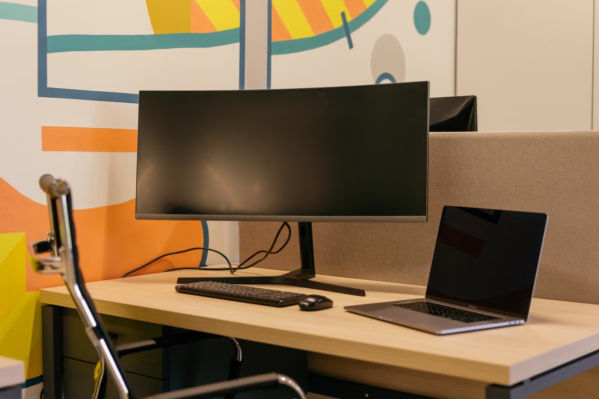
Your remote design canvas looks warmer or duller than the same file on your Windows screen.
Fast answer: Check the Mac’s connected display and color profile, the remote session’s appearance, and the exported file separately. A remote preview can help you inspect settings and workflow, but it cannot prove color accuracy or predict a printed result. Use the target display, output conditions, or a physical proof for final approval.
Who this is for: Windows-first designers who use a remote Mac for macOS-only design work and need to distinguish a screen mismatch from a file problem.
Small creative teams assessing a Mac mini M6 workflow can use these checks to set a clear review boundary.
Designers handing off brand colors, photography, or print files should treat output verification as a separate task.
This week’s action: Save one test export, inspect the Mac’s display profile, and compare that same file on the intended review display before changing project colors.
Last updated October 26, 2026. Product and macOS information checked against Apple’s Mac mini technical specifications and Apple’s display calibration guidance. These references confirm product and system information; they do not establish color performance for a particular remote service or setup.
01Mac mini M6 remote design colors look inaccurate: separate the three views
Treat these as three different things, not one verdict:
- The design file: Its color values, embedded profile, and application settings.
- The remote preview: What you see through the remote session on your current device.
- The physical display: The monitor, its selected profile, calibration state, and viewing conditions.
A difference between the remote preview and your local screen does not, by itself, mean the project file has changed or become damaged. The two screens may have different characteristics, and your remote view adds another place where appearance can differ. Apple notes that display calibration and the selected display profile are part of how colors are represented; see its display calibration guidance.
Why can remote Mac colors look different from your local screen?
The remote image and local screen are not the same physical display. Differences in the monitors, selected profiles, and viewing conditions can affect what you perceive. First compare the file and application settings; do not edit colors just to make one screen resemble another.
Use one unchanged test export for your first comparison. Open it on your local Windows machine and in the remote Mac environment. Keep the file name and export settings consistent, and note whether the difference appears in the application canvas, the exported image, or both. That narrows the search without introducing new edits.
02First check: confirm the Mac’s display and profile
Before changing a design document, confirm which display the Mac is using and which profile is selected for it. A remote Mac’s display settings describe its available display environment; they do not certify that the screen you are watching remotely is color-accurate.
On the Mac, open the display settings and check the connected display shown there. Review its selected color profile and any applicable reference mode. Apple’s guide explains the macOS display calibration controls, while Apple’s ColorSync Utility guide describes working with color profiles. For an explanation of why a monitor profile matters in a design workflow, see Adobe’s monitor calibration and profile guidance.
Where do you check the macOS display color profile?
Start in the Mac’s display settings and identify the display currently in use. Check the profile assigned to that display, rather than assuming the remote screen inherits the profile from your Windows monitor. If you need to inspect profiles in more detail, use the ColorSync Utility documentation as a guide.
If the intended display is missing, or the listed display is not the one you expected, pause color judgment. Record what the Mac reports and confirm the actual output path with whoever manages the remote environment. Don’t select a profile merely because its name sounds familiar. A profile that does not describe the actual display can make the preview less representative, not more.
Apple’s technical specifications confirm the 2026 Mac mini M6 product information, but that product reference does not state that every display or remote connection will reproduce a particular color. Treat the display in use, its profile, and the review conditions as the things to verify—not the Mac model name as a color guarantee.
03Second check: find out whether the mismatch is in the file
Compare the same saved file across environments before adjusting its colors. If the file’s values and profile information are unchanged, but its appearance differs between screens, the difference may be in the viewing environment rather than the artwork.
Use this sequence:
- Save a copy of the original project and export a clearly named test image.
- Note the application’s document color settings and the profile used for the export.
- Open the test export on the remote Mac and on the local machine.
- Compare the export with the application canvas on each device.
- If possible, have the intended recipient open the same file on the target review display.
The key observation is where the difference first appears. If the application canvas and export look alike on the Mac but both look different on the Windows display, investigate the displays and viewing conditions before changing the artwork. If the exported file looks different from the application canvas on the same environment, review the export and color-management settings. If only the remote view differs, record that as a remote-preview concern and use another route to inspect the final output.
How can you tell whether the difference comes from the remote view or the design file?
Compare an unchanged export and the project’s color settings, not two separately edited versions. If the file and settings remain consistent but the screens disagree, the evidence points toward the viewing chain. If the export itself has unexpected values or profile information, investigate the document and export workflow.
For an application-specific reference, Adobe’s Illustrator color-management guidance for printing explains why document and output settings matter. Follow the requirements for the application and delivery destination you actually use; don’t assume one export preset is suitable for every recipient.
04Third check: treat the remote preview as a review aid, not a proof
A remote session can help you open the design application, inspect project settings, and confirm that the expected file is available. It can also help you catch workflow problems, such as reviewing the wrong document or exporting an outdated version. Those are useful checks, but they are not a substitute for validating the physical display or output.
The remote image is being viewed on your local screen. That makes it easy to mistake what the session shows for a direct measurement of the Mac’s display. Unless you have verified the full display and review setup, you cannot infer color accuracy from a remote preview alone. No claim about a particular remote encoding or color-transfer behavior should be made without evidence for that specific environment.
Review boundary: Use the remote session to check the file, app settings, and export workflow. Use the intended physical display or an approved proofing process to decide whether the delivered color is acceptable.
Consider a brand designer working on a Windows laptop who opens a Mac design app remotely. The remote canvas looks less saturated than the local reference. If the designer immediately increases saturation until the remote view looks right, the file may no longer match the approved brand values. The safer move is to preserve the file, compare its color settings and export, and ask the reviewer to assess the same export under the agreed viewing conditions.
If you need a repeatable environment before starting a project, see the remote Mac design environment acceptance guide. Use it to confirm that the application and working files are accessible, not as evidence that the display has been calibrated for a particular color-critical task.
05Brand, photography, and print work need different acceptance checks
A single screen comparison does not cover every type of delivery. Decide what “correct” means for the specific handoff.
- Brand assets: Confirm the approved color values, the project and export settings, and the recipient’s file requirements. Keep a reference export with the project so reviewers can compare the same artifact.
- Photography and screen content: Agree on the target display conditions and review device. A remote preview can flag a possible difference, but the intended display remains the relevant reference.
- Print work: Follow the print provider’s file and output requirements. Ask whether a proof is needed, and review it under the agreed conditions. A screen preview cannot confirm the appearance of ink, paper, or a finished printed piece.
For print workflows, Adobe’s Photoshop printing guidance covers color-managed printing, and its hard-proof guide explains the role of a proof in reviewing expected output. Use those as workflow references, then follow the actual requirements from your print provider.
Can a remote Mac accurately verify brand or print colors?
It can help you confirm that the right file, values, and output settings are present. It cannot, by itself, certify what a recipient will see on another display or what a print process will produce. For final approval, rely on the target display conditions or the required physical proof.
That distinction matters when different people own different parts of delivery. The designer can check the project and export. The recipient or print provider may need to confirm how the file behaves in its target environment. Make that responsibility explicit instead of treating a remote session as a universal color approval step.
06A decision checklist for isolating the cause
Work through this list before changing approved artwork. Save notes alongside the test export so another person can repeat the review.
- [ ] I saved an unchanged copy of the design project.
- [ ] I exported one test file and recorded the export settings.
- [ ] I checked which display the Mac reports as active.
- [ ] I noted the selected display profile and any applicable reference mode.
- [ ] I compared the same export on the remote Mac and my local display.
- [ ] I recorded whether the mismatch appears in the app canvas, the export, or only the remote preview.
- [ ] I confirmed the recipient’s required file format, profile, and review conditions.
- [ ] For print delivery, I checked whether a provider-approved proof is required.
- [ ] I kept the test file, display settings, and reviewer feedback together.
If the project file and export remain consistent but the remote view disagrees, do not “correct” the artwork to suit that view. Continue checking the display and review setup, or arrange a comparison on the intended physical display. If the file or export settings differ, correct those workflow issues first and create a new test export. If the file is for print and output approval remains uncertain, request the appropriate proof rather than treating a screen image as the final answer.
07When a remote Mac fits the project
A remote Mac can make sense when you need macOS design software, want to check a Mac-specific workflow, or need to work on a Mac project without buying a computer for occasional use. Before choosing that route, separate access needs from color-proofing needs.
Advantages
- You can access a macOS design environment from a Windows-based setup.
- You can inspect the actual project and export workflow in the Mac application.
- You can test whether the workflow fits before treating remote access as a regular part of production.
Limits
- Remote viewing does not establish color accuracy for your local screen.
- It does not replace an agreed target display, calibration process, or print proof.
- A remote workflow may be unsuitable if the task depends on direct physical display connections or ongoing color-critical review that you cannot validate remotely.
If you are comparing service availability, use current service information rather than assuming that a page for a different Mac mini model describes an M6 environment. The Mac mini rental information is a place to review the listed option and confirm what is currently offered. It is not evidence of M6 availability or a color-accuracy guarantee.
Keep the choice tied to the work. If you need occasional access to a Mac application and can complete final color approval on the target display or through a proper proof, remote access may be a practical test environment. If your regular work requires controlled physical viewing conditions, direct display connections, or frequent print approval, a locally managed Mac and calibrated review setup may be the better long-term fit.
When the mismatch remains unclear, preserve the project, test export, Mac display settings, and recipient feedback. That record tells you whether the next step is to correct the document, investigate the remote viewing setup, or validate the intended output. Renting a Mac from VpsMesh can give you a way to test a macOS design workflow without committing to Mac hardware; use it for access and process checks, and keep final color approval with the display or proofing method your project requires.